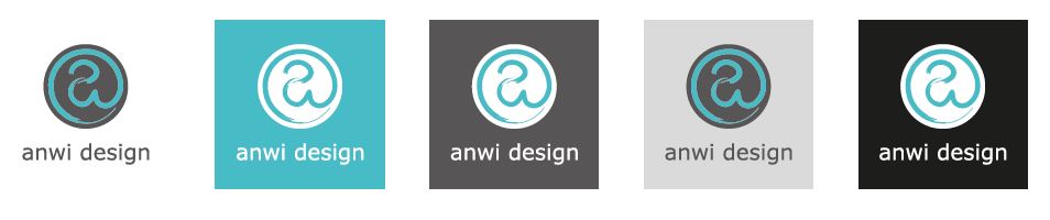
anwi-Design Logo
The logo was created from myself for myself. It contains a small “a” for Antonia and a small “w” for my surname. I. Both letters build an “@” sign for the digital aspect in my work. I chose the lowercase letters because they have rounder shapes than the corresponding capital letters. This looks harmonious and suits my character. The letters are drawn with a paint brush to represent the artisanal and analogue.
Click here to see different Logo versions