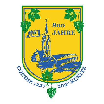
PIKES Logo
PIKES is a robotic company for automation technologies, driverless transport systems, Industry 4.0 and Smart Factory. The briefing involved developing the name “Pikes” for a robotics company, with a focus on incorporating Superman-inspired colors and aesthetics. This led to the creation of the red-and-blue logo. “Pikes” translates to “Hecht” in German, which made the symbol of a pike fish a natural choice for me. However, the concept evolved by merging the initial letter “P” of “Pikes” with the shape of a pike, resulting in a more abstract design. The wordmark is presented in simple, bold lines, which fits well with the tech-forward and modern feel of the brand. The company is represented in blue and red to portray itself as a “superhero” solving problems where other robotics companies fail. The blue specifically symbolizes the technical aspect of the business.

Click here for the design process
I tried to make the Logo more lively and tried different colors at the beginning. Yellow stand for innovation and I thought, it might be a good choice. The customer wanted a more straight forward Logo and so I tried to adjust a few things in the second image.

Here you can see my final adjustments and styles to the Logo and the inspiration from the Superman Logo.
